



Your Custom Text Here
East Lexington, MA
Photography by Two Shots Photography in New Hampshire
If you have been following along with our Earthy Modern project on Instagram, you might have noticed some preview pictures. We are so excited to be sharing with you the final product for this home and take you on some of the journey and thought process that went on.
Kitchen & Mudroom
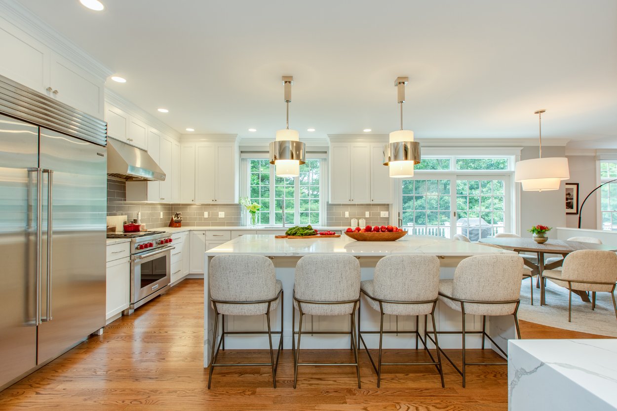
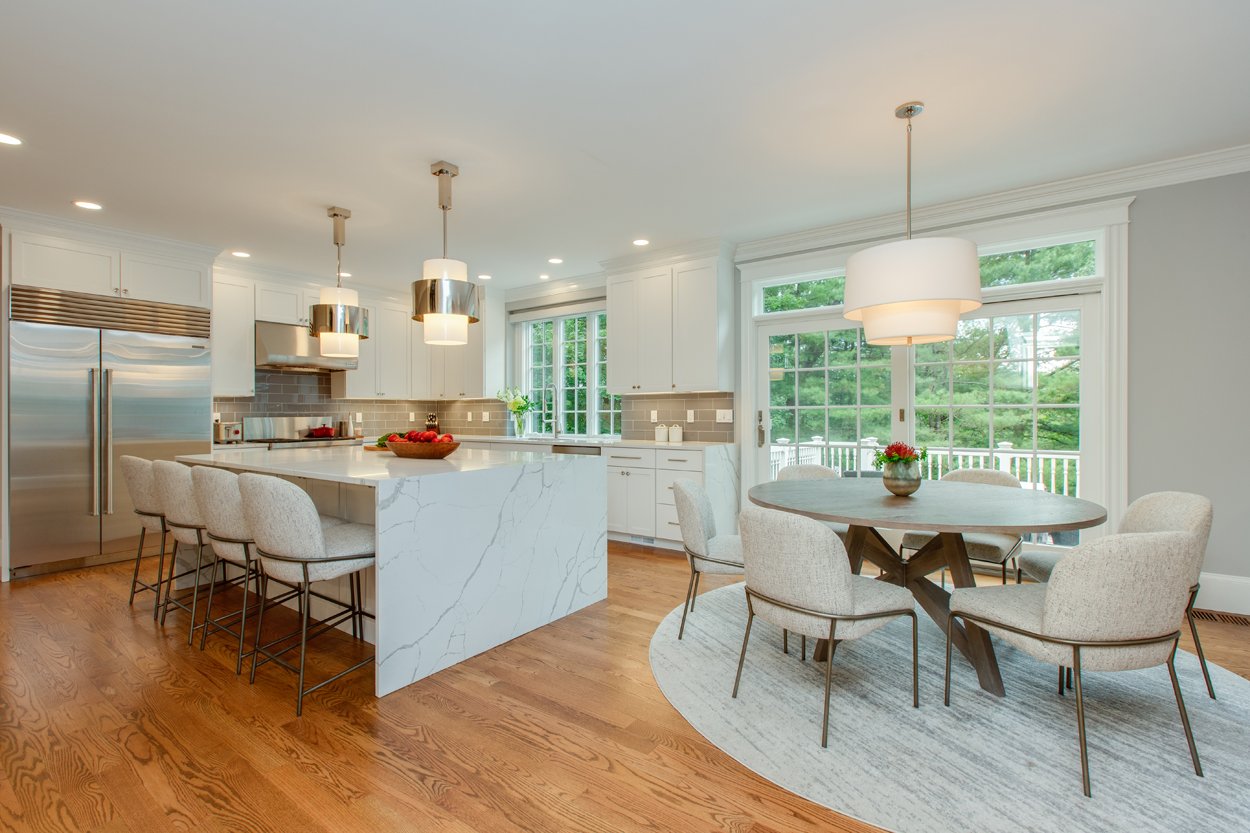
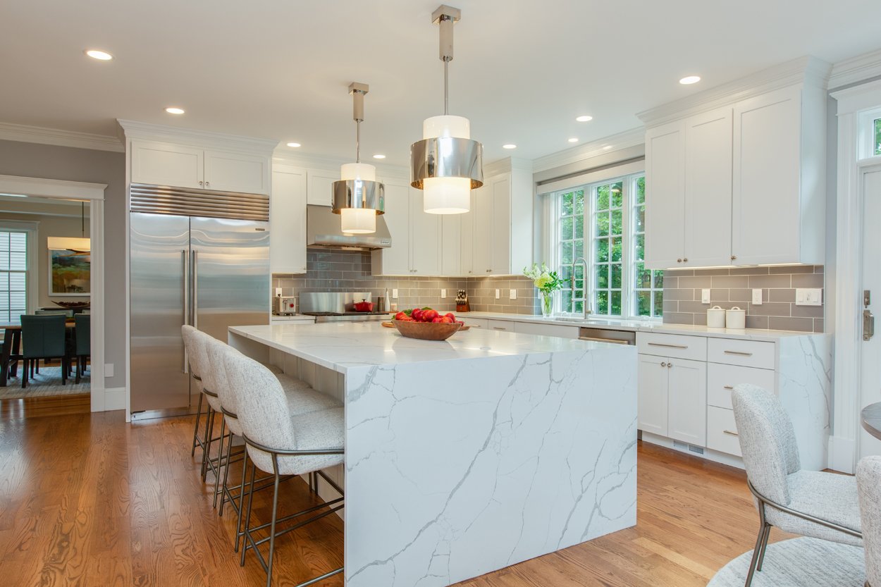
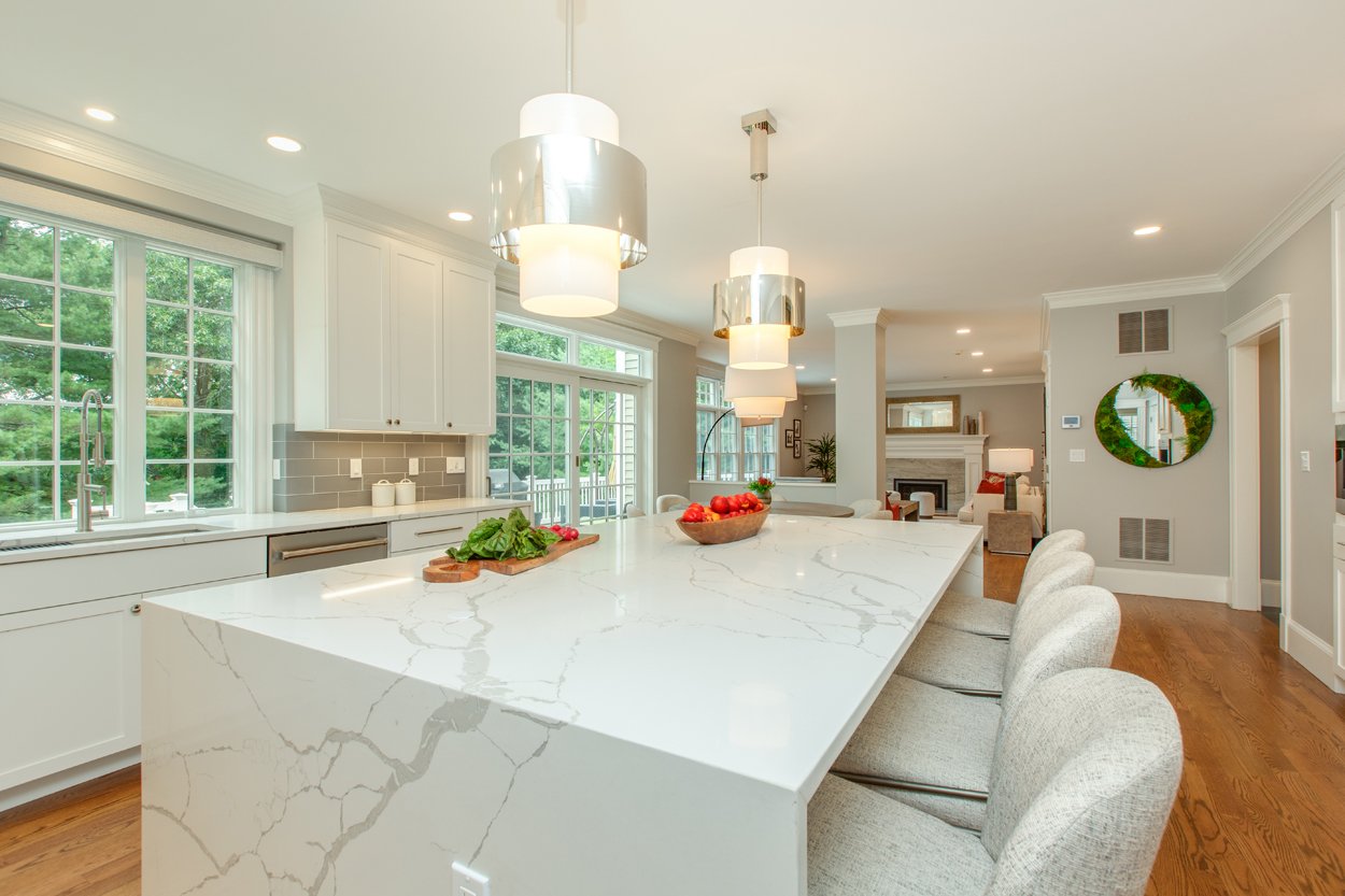
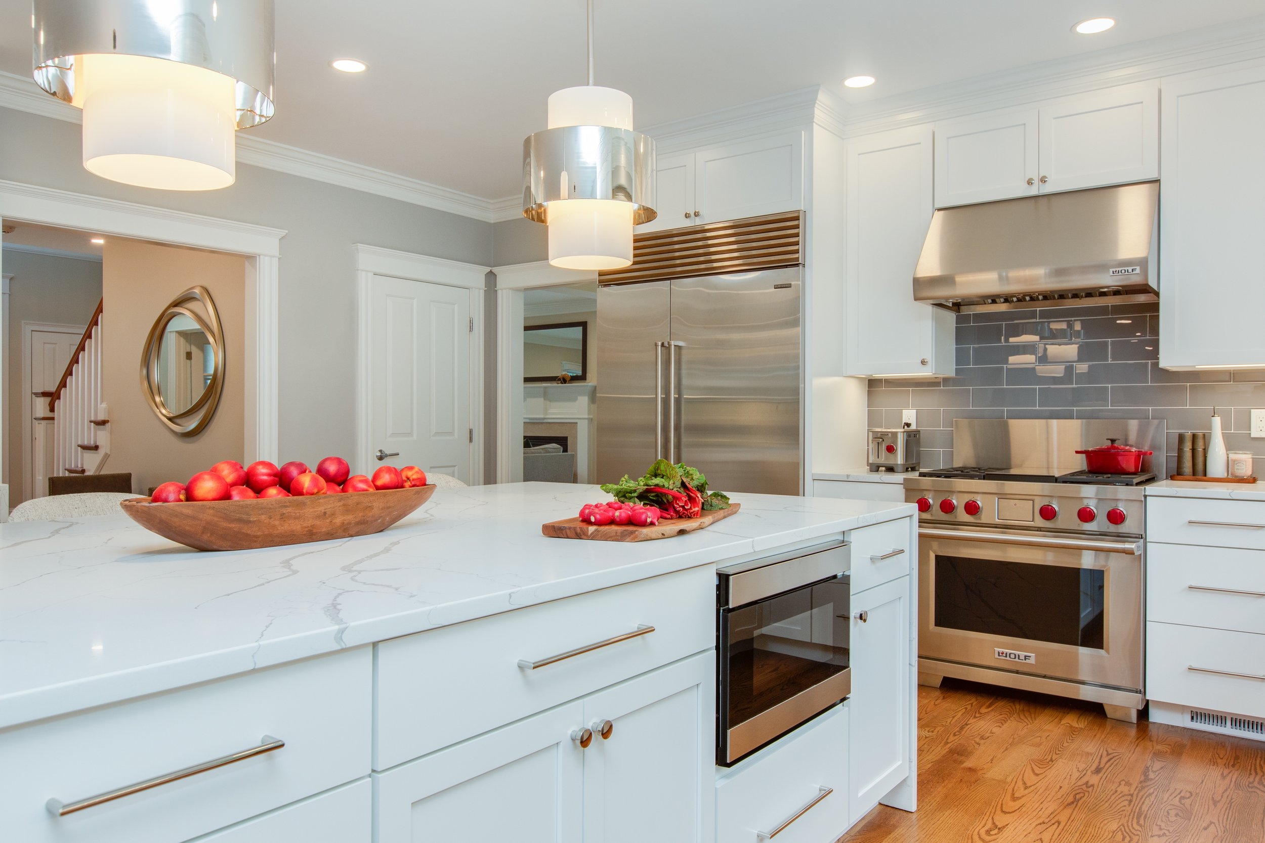
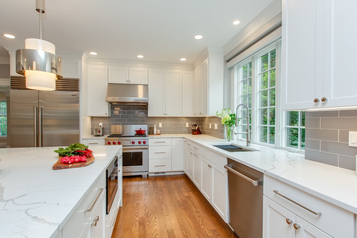
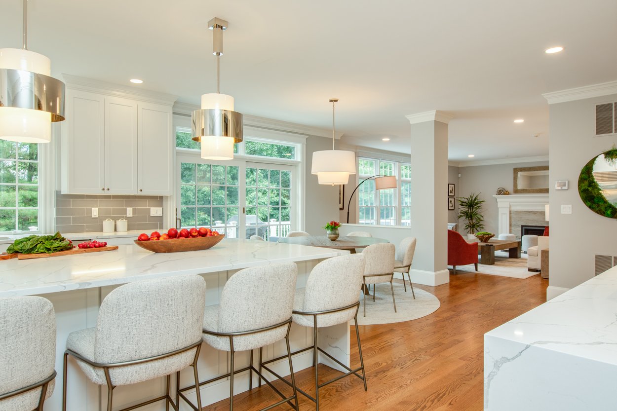
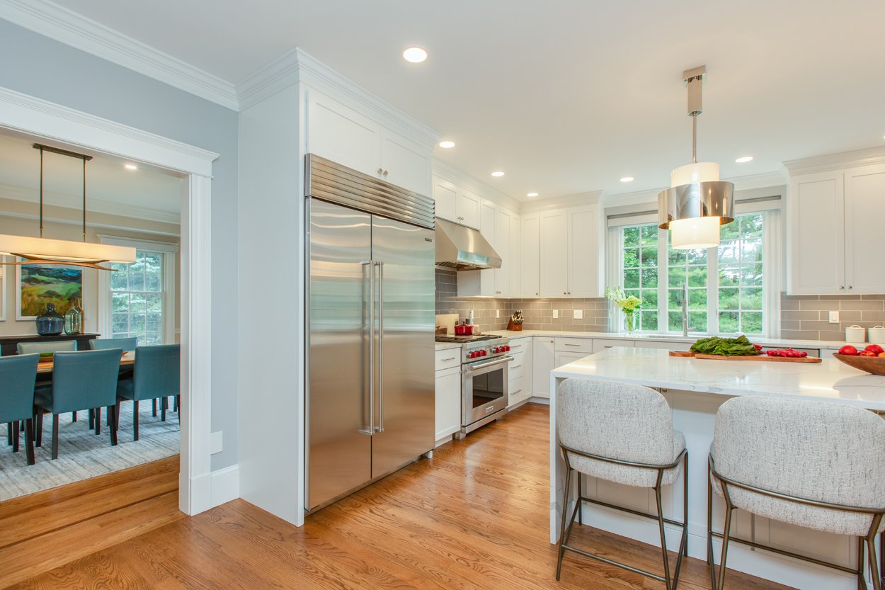
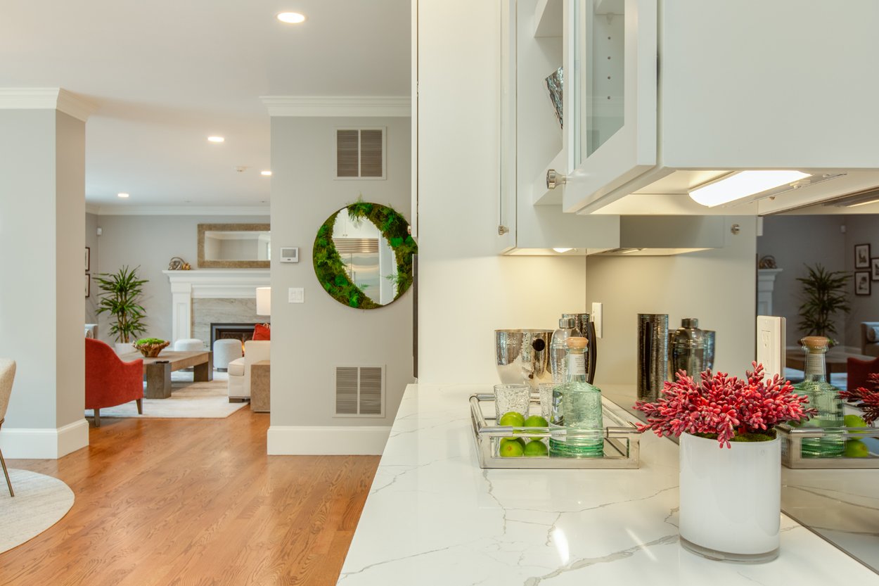
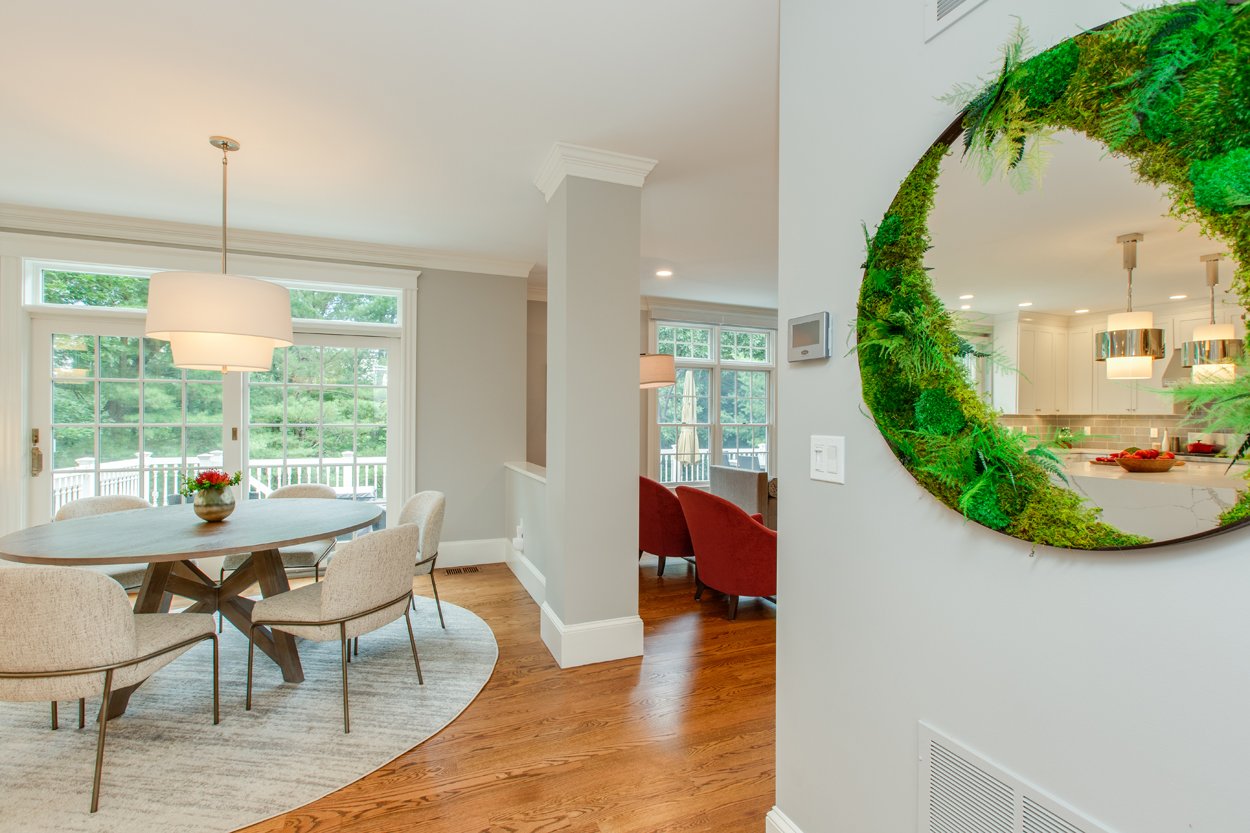
This Kitchen was the major tip of the iceberg for this project. Originally it had a diagonal island, which created a lot of unusable space, dark outdated cabinets, and was not reaching its full potential. The space also featured a traditional Roman column, between the Kitchen and Family Room, which was made more modern by squaring it out. Between all of these major changes the clients decided to redo all of their wood flooring, staining it a light warm brown to neutralize the home and take out the yellow/orange coloring.
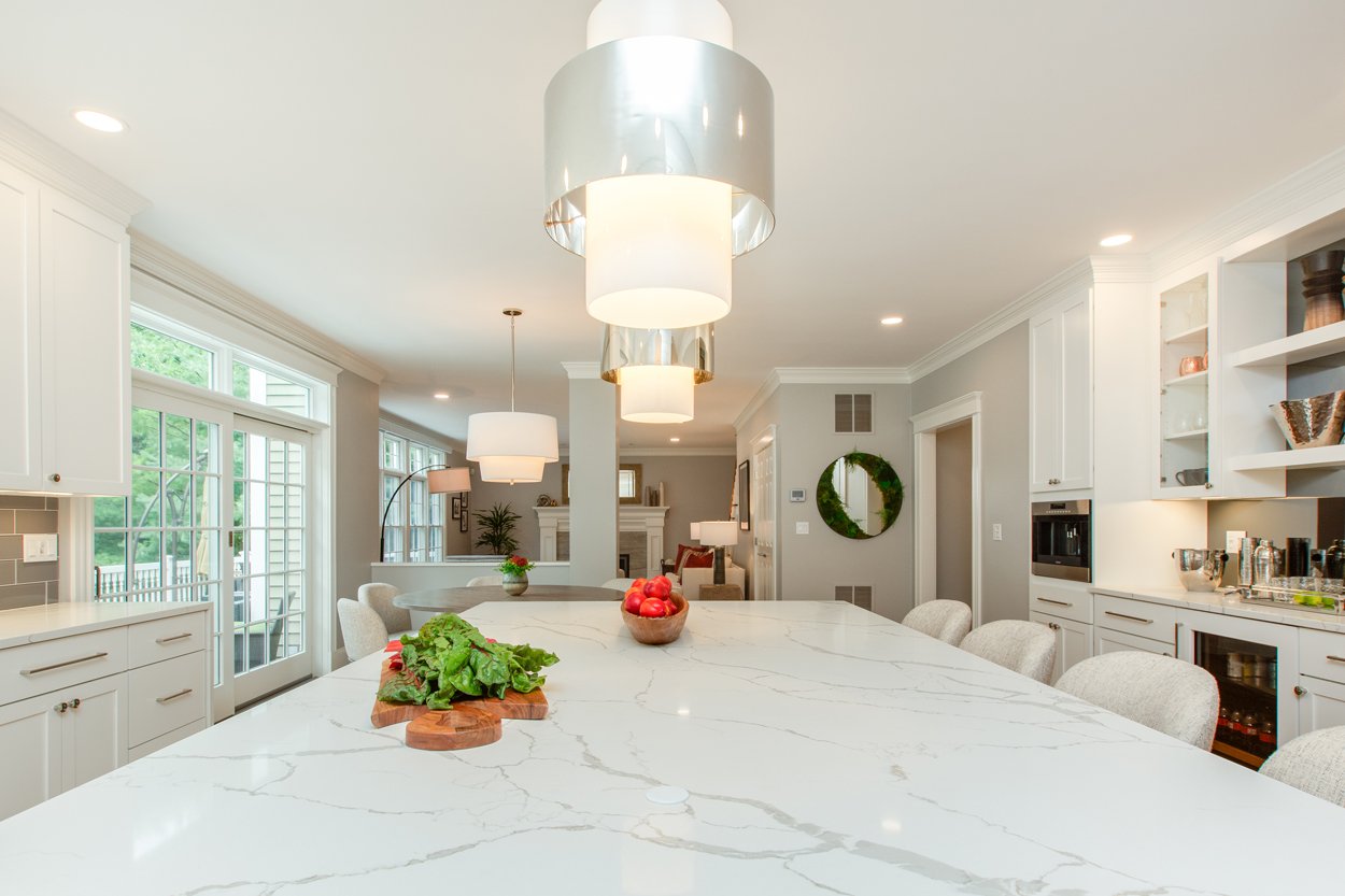
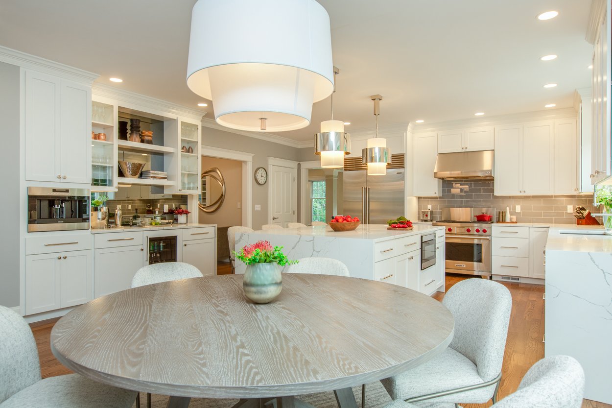
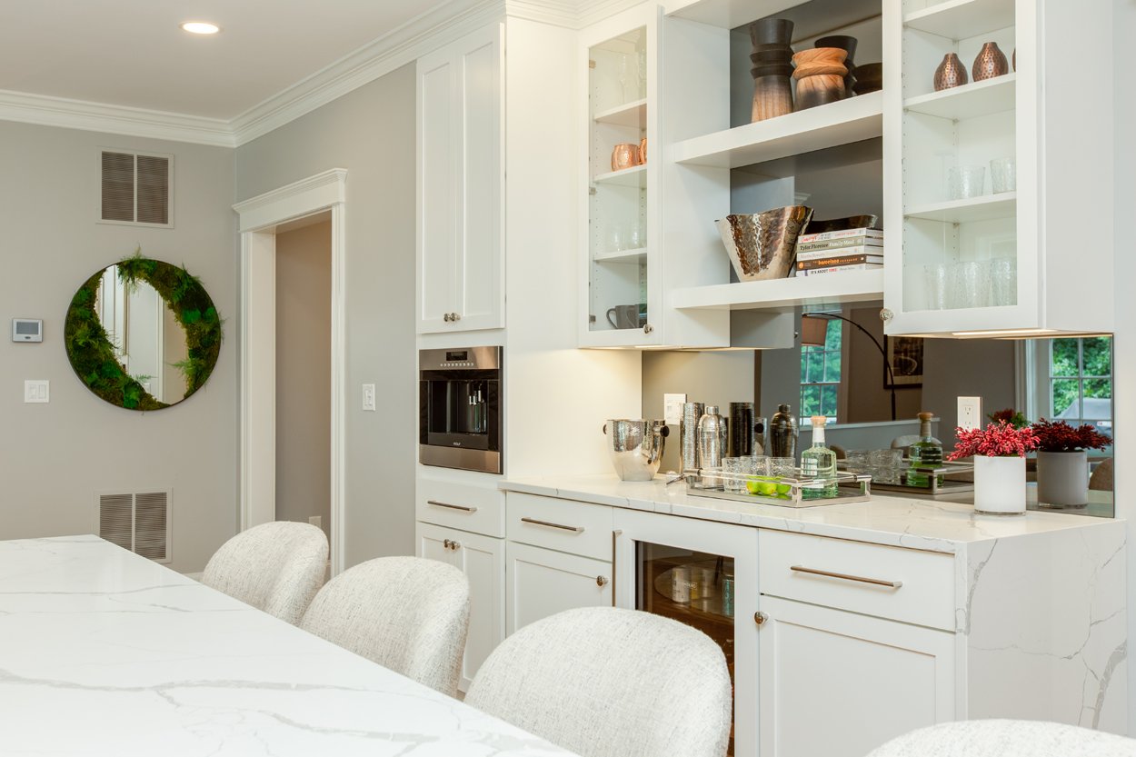
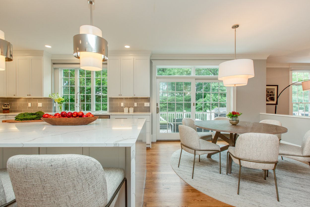
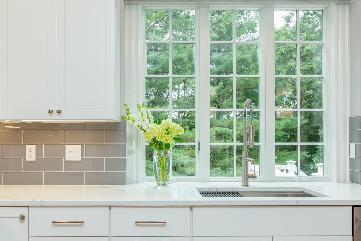
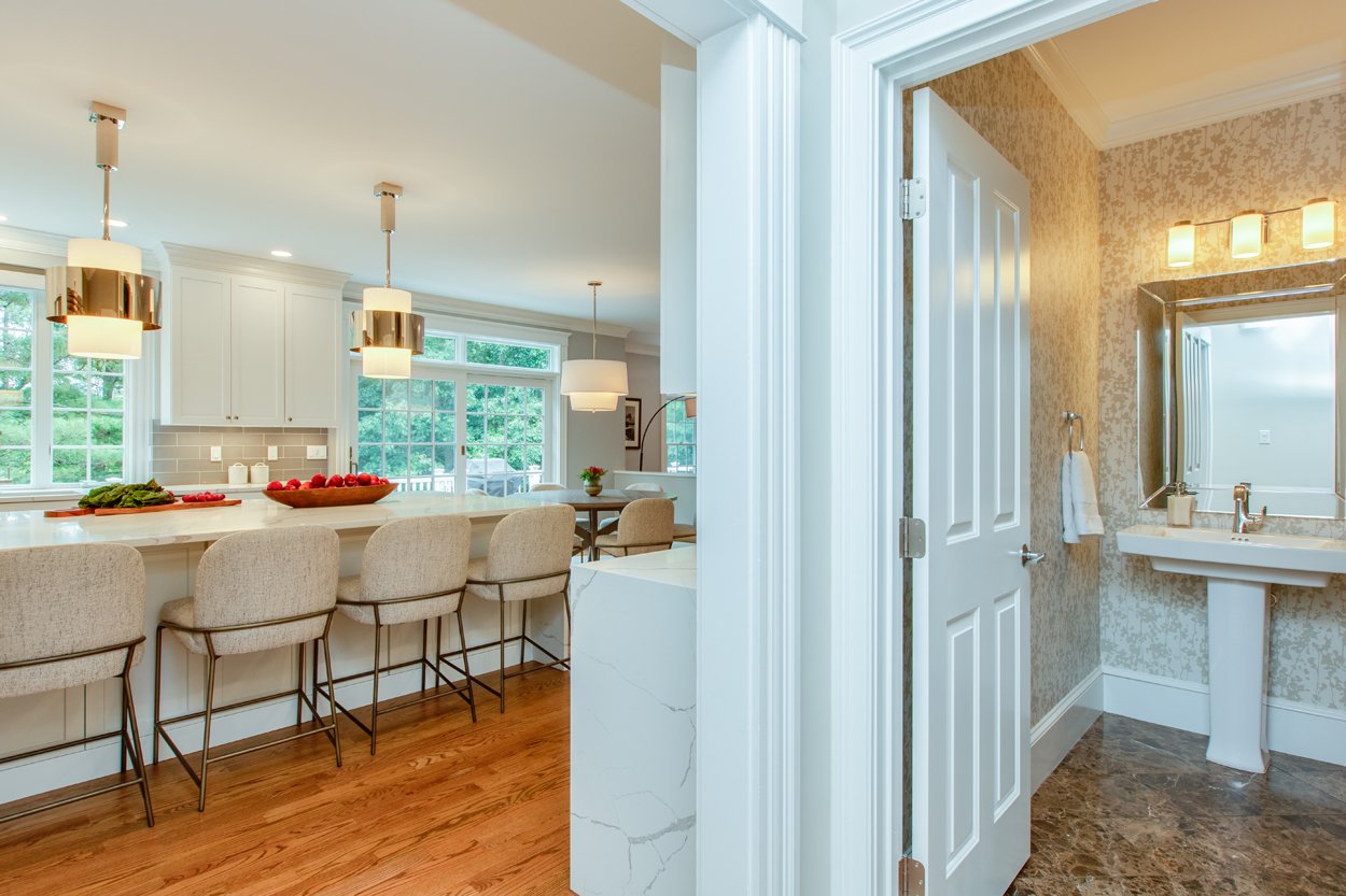
We started by selecting all new white cabinets to go with a white quartz countertop. The new island design was created to be as big as possible to not only maximize the work surface and entertaining area, but give the illusion of a larger kitchen. What gave the kitchen its wow factor though, were the waterfall edges on the island. Nothing says “wow” more than large slabs of stone with seamless mitered edges.
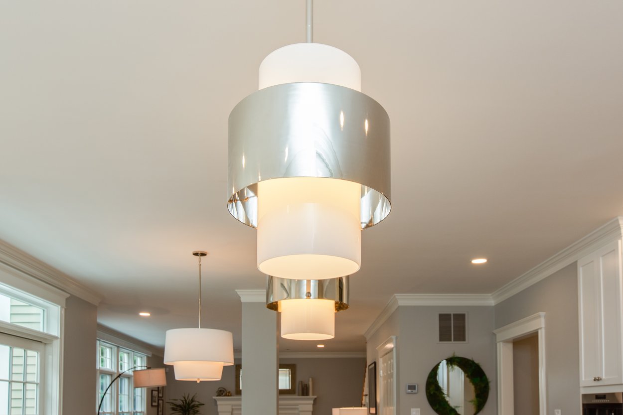
To balance out with the massive island, we opted for two large circular pendants instead of three smaller lights. We then chose a complimentary circular fabric drum shade for the everyday dining space to soften the room.
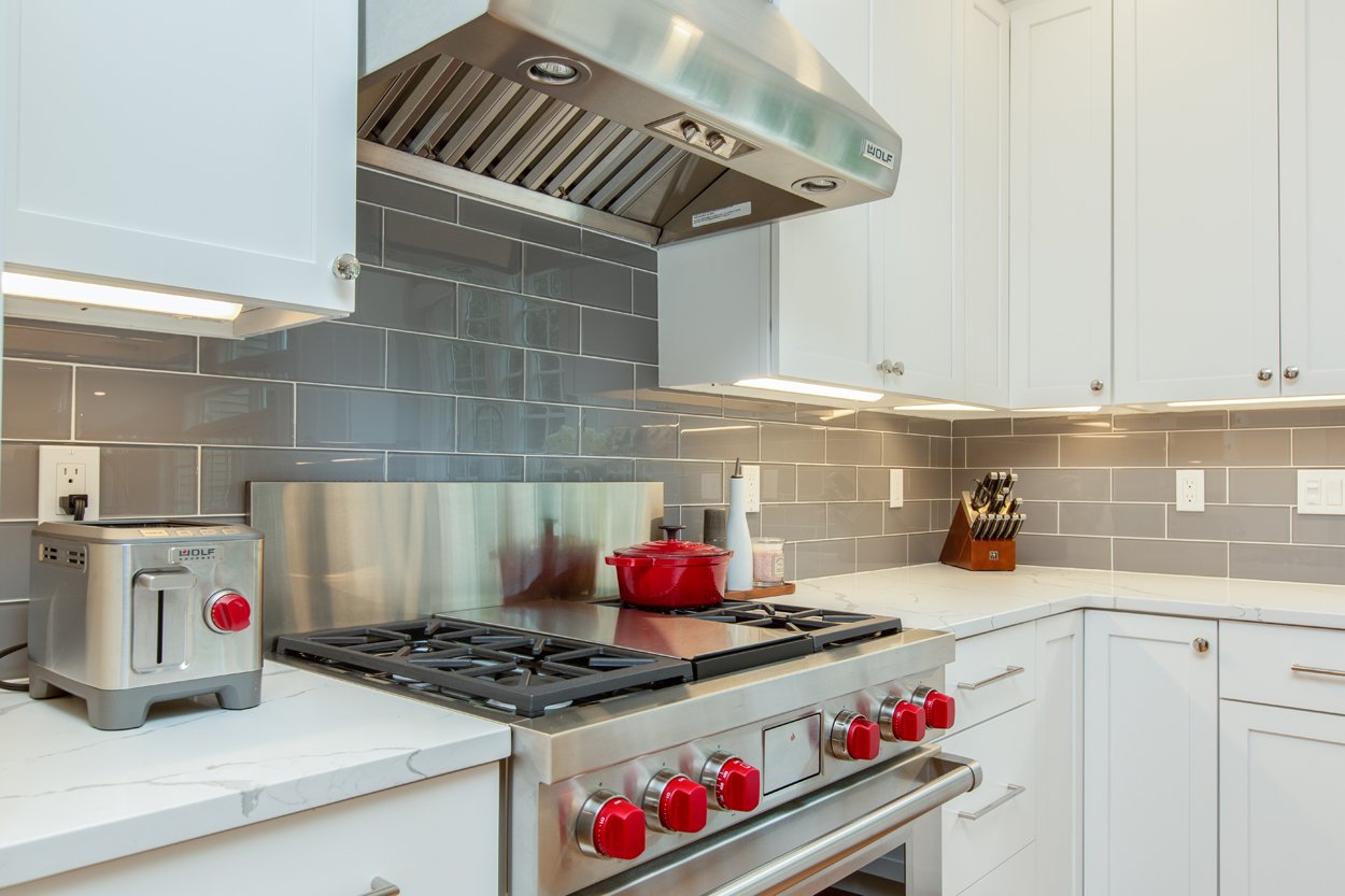
Finally, the dark gray ceramic backsplash comes in to break up all of the white, coordinating with the veining in the countertop.
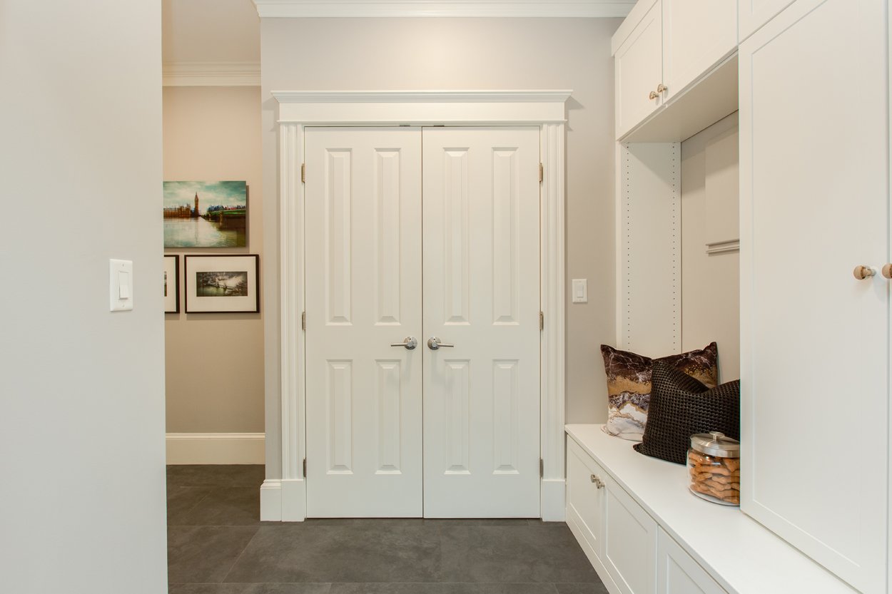
Off the Kitchen is the Mudroom, and for this we brought in a local closet company we have worked with in the past. They were able to maximize the space, providing a more efficient organization system inside the closets and also adding on a wall of cabinets for extra pantry space. We selected a large modern tile for the floor to keep it clean and simple, using their personal color photography framed pieces, and accent pillows for personality.
Living Room
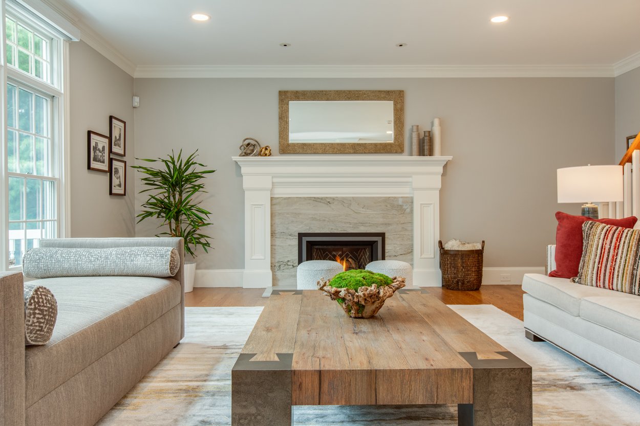
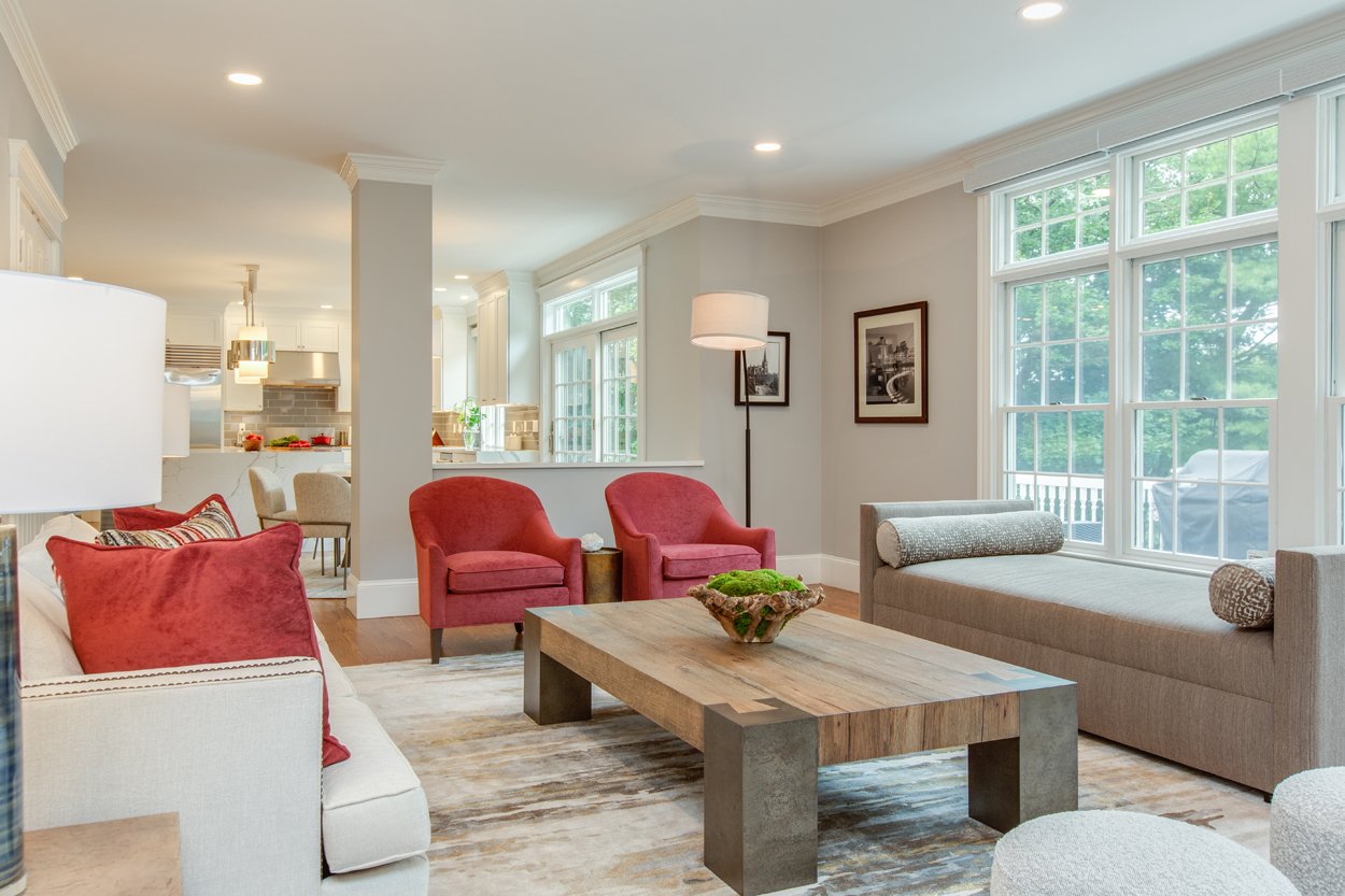
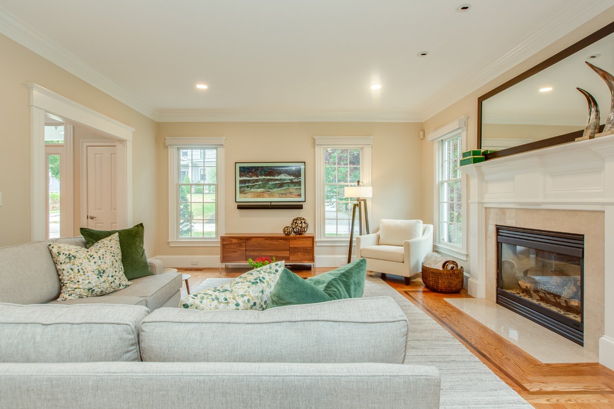
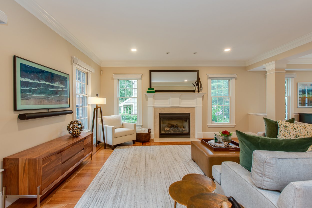
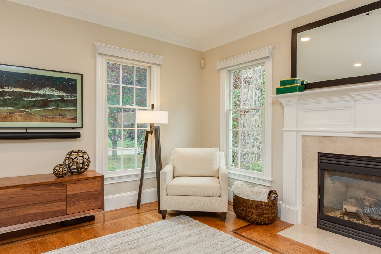
We loved that this family wanted to use these next few spaces in a way that fits them. Where a traditional room with a TV would be found off the Kitchen, they wanted it as a hang out space. A place for the kids to be on their tablets or playing with toys, and a spot for the parents to catch up on a good book, but all be in the same room together.
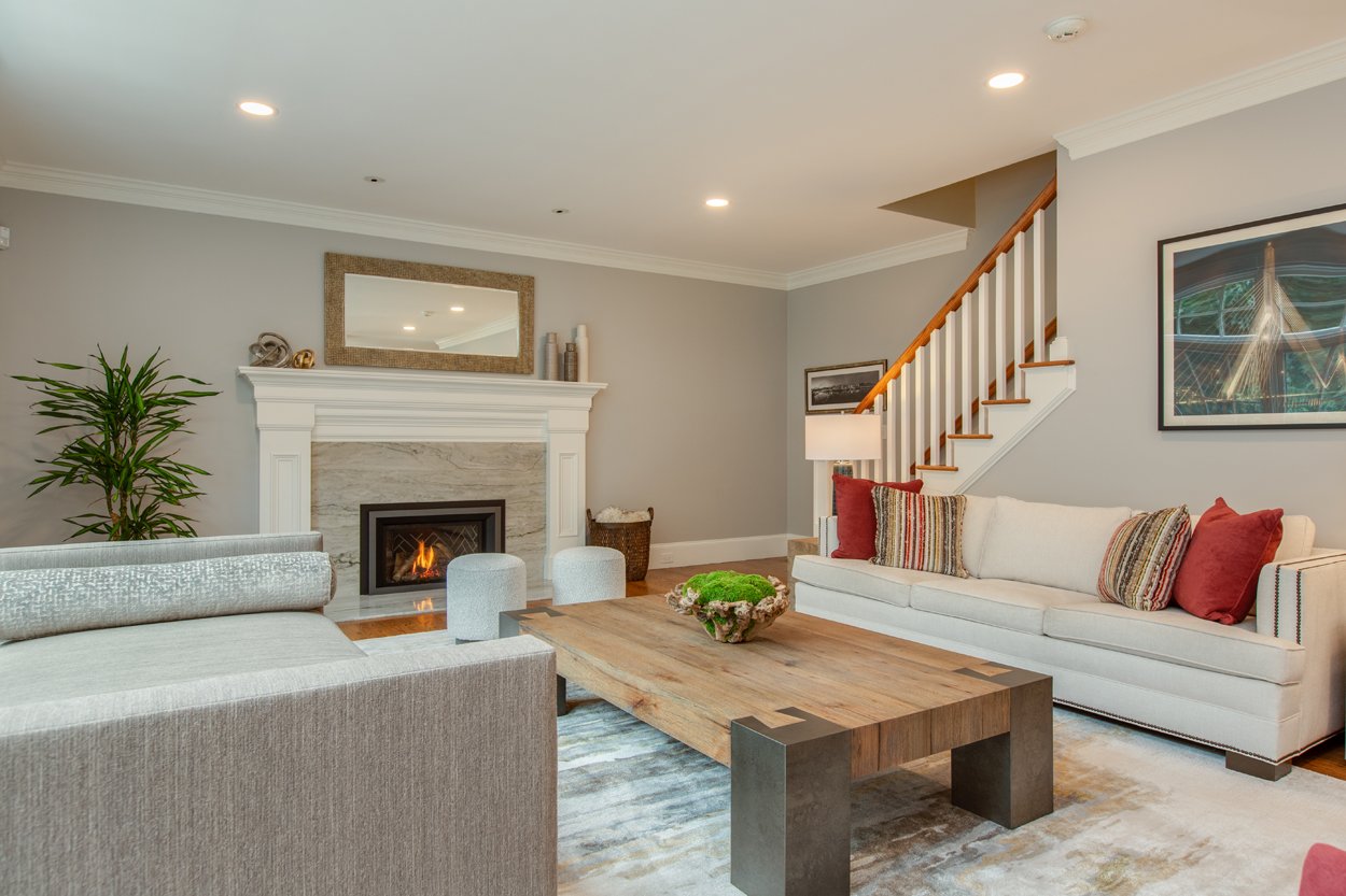
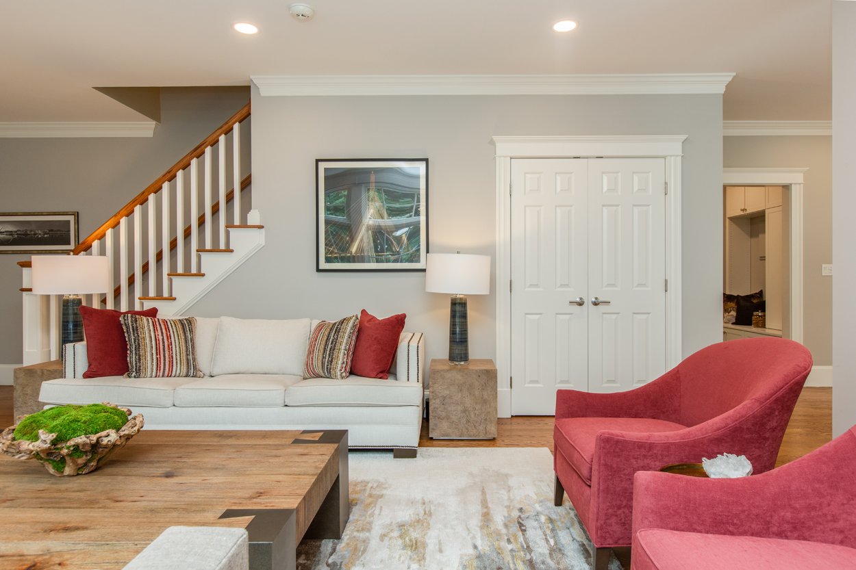
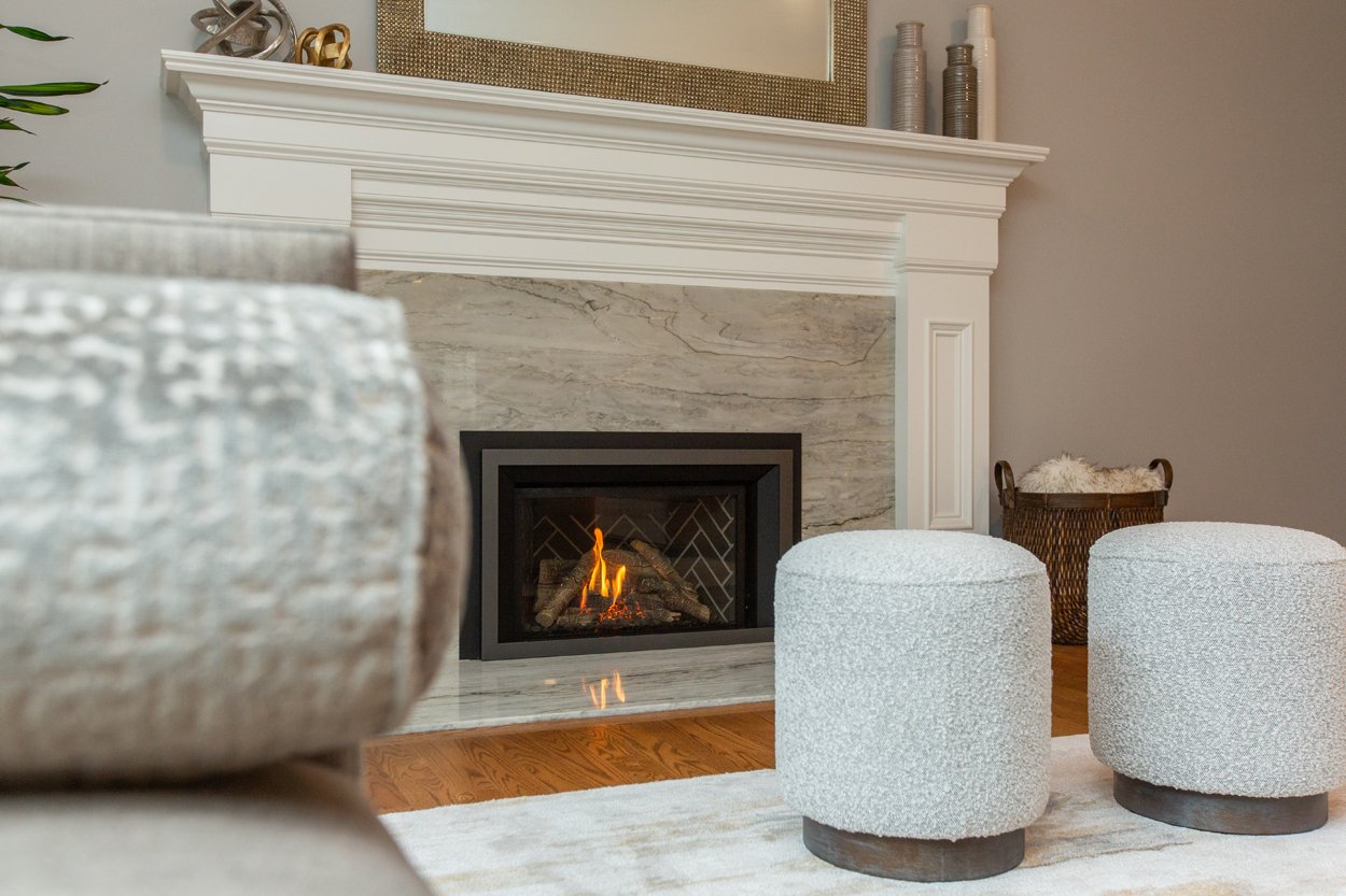
They had a gorgeous large window looking out into the backyard that let in a ton of natural light. This inspired us to create a large custom daybed, almost the size of a twin bed. We placed a large comfortable sofa from Ethan Allen across from the daybed with pillows that became the main color inspiration for the room, pops of red being sprinkled throughout, as you see in the side chairs. Another show stopping piece in this room was the coffee table. The large scale of it really grounded the space and also balances out the other large furniture pieces making it cozy.
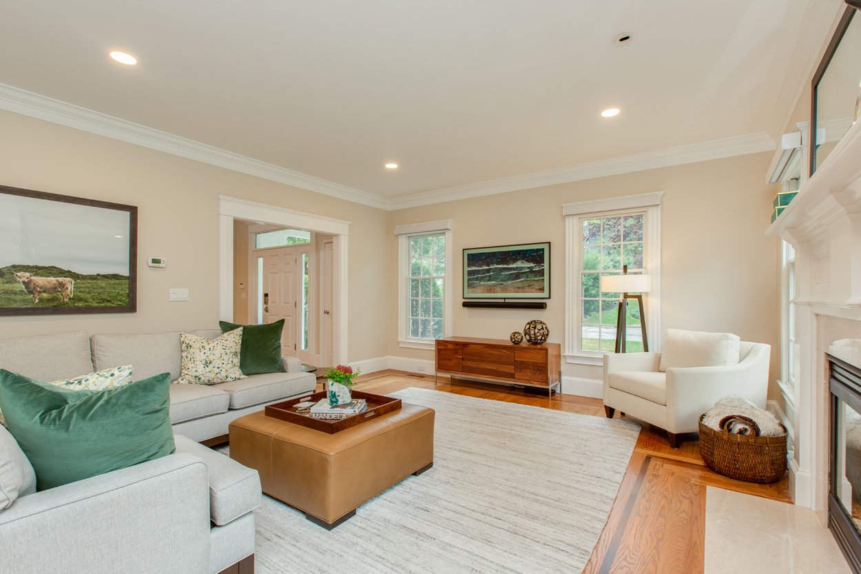
As a personal touch, we wanted to incorporate our client's collection of framed photography that they’ve collected over the years. We grouped them into small galleries, which was a way to include as many as we could in one space and knew they would all complement one another.
Dining Room/Family Room
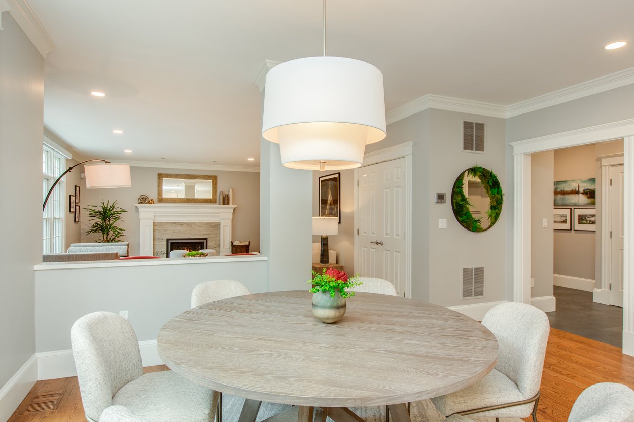
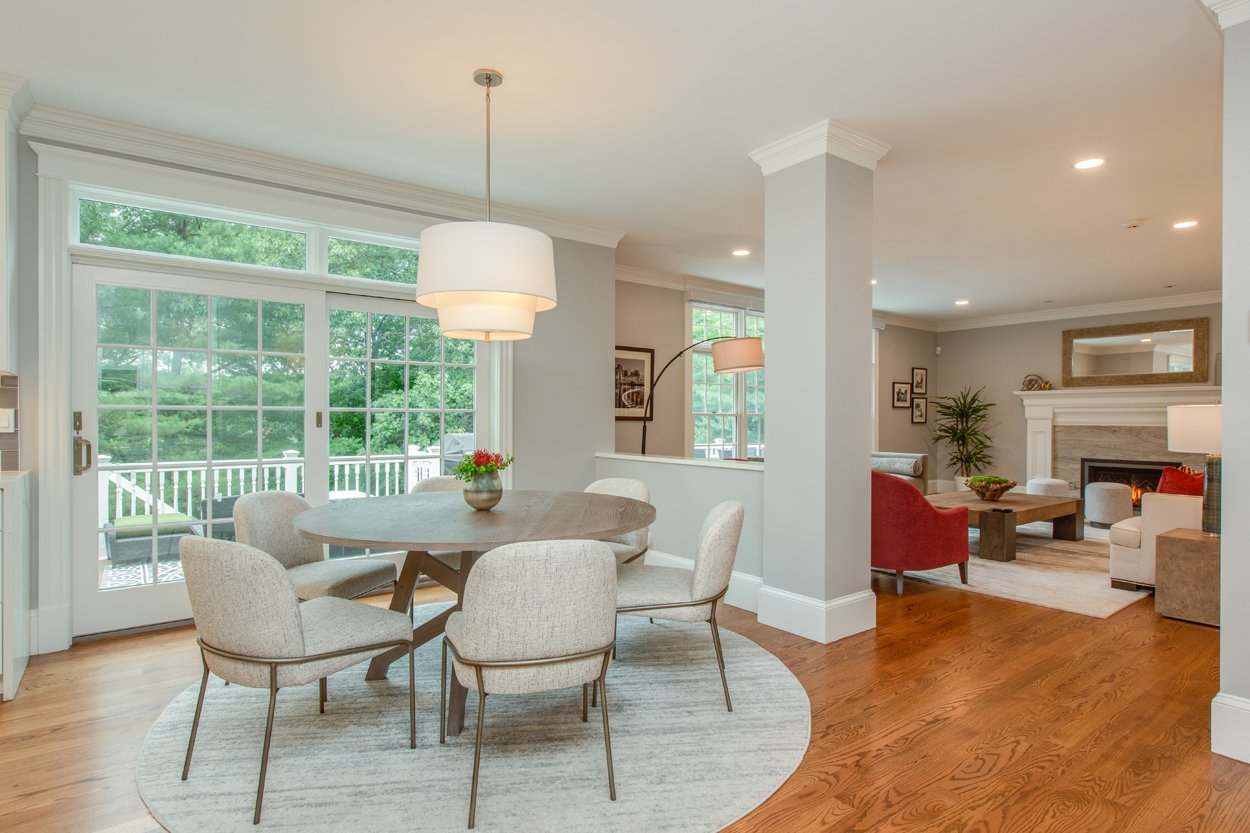
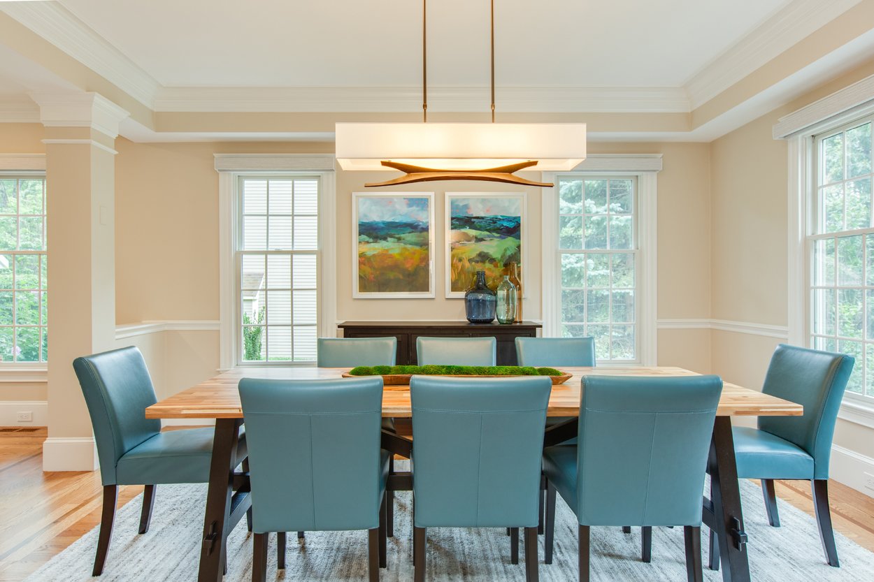
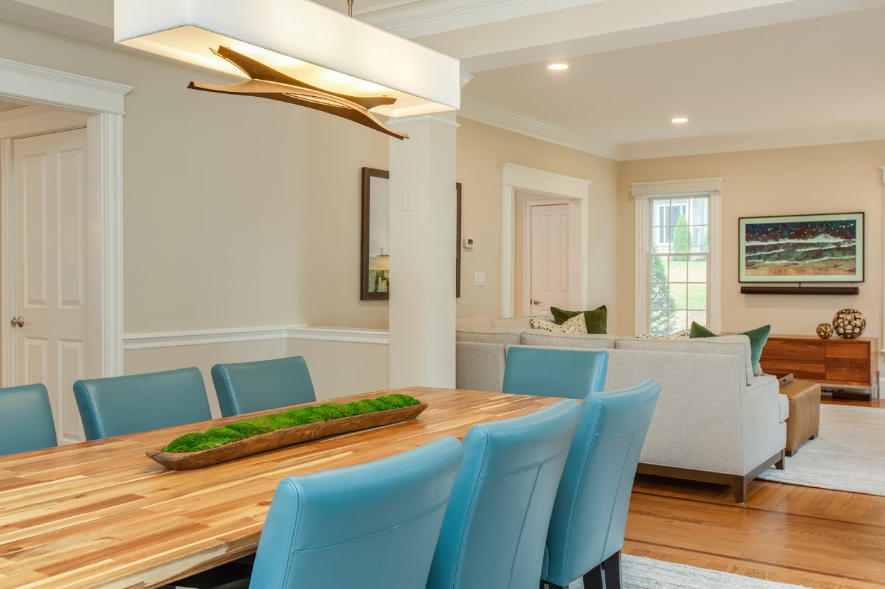
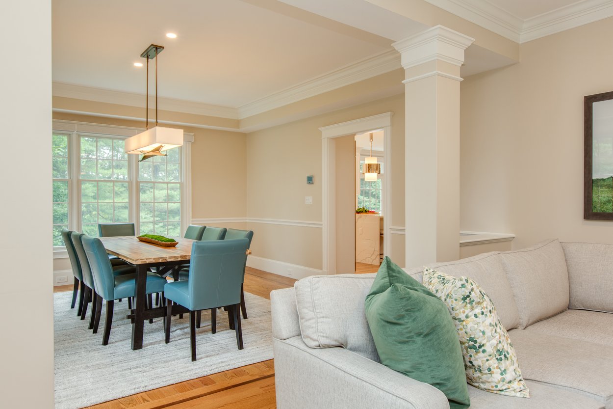
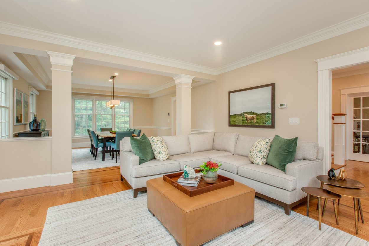
Since the Dining and Family Room are open to one another, we looked at these two spaces as one. We used the same area rug for both and similar color schemes.
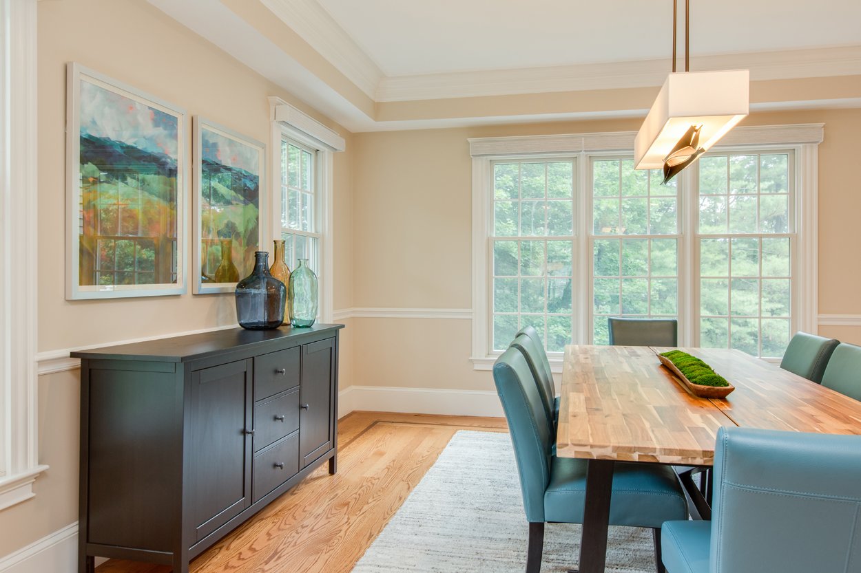
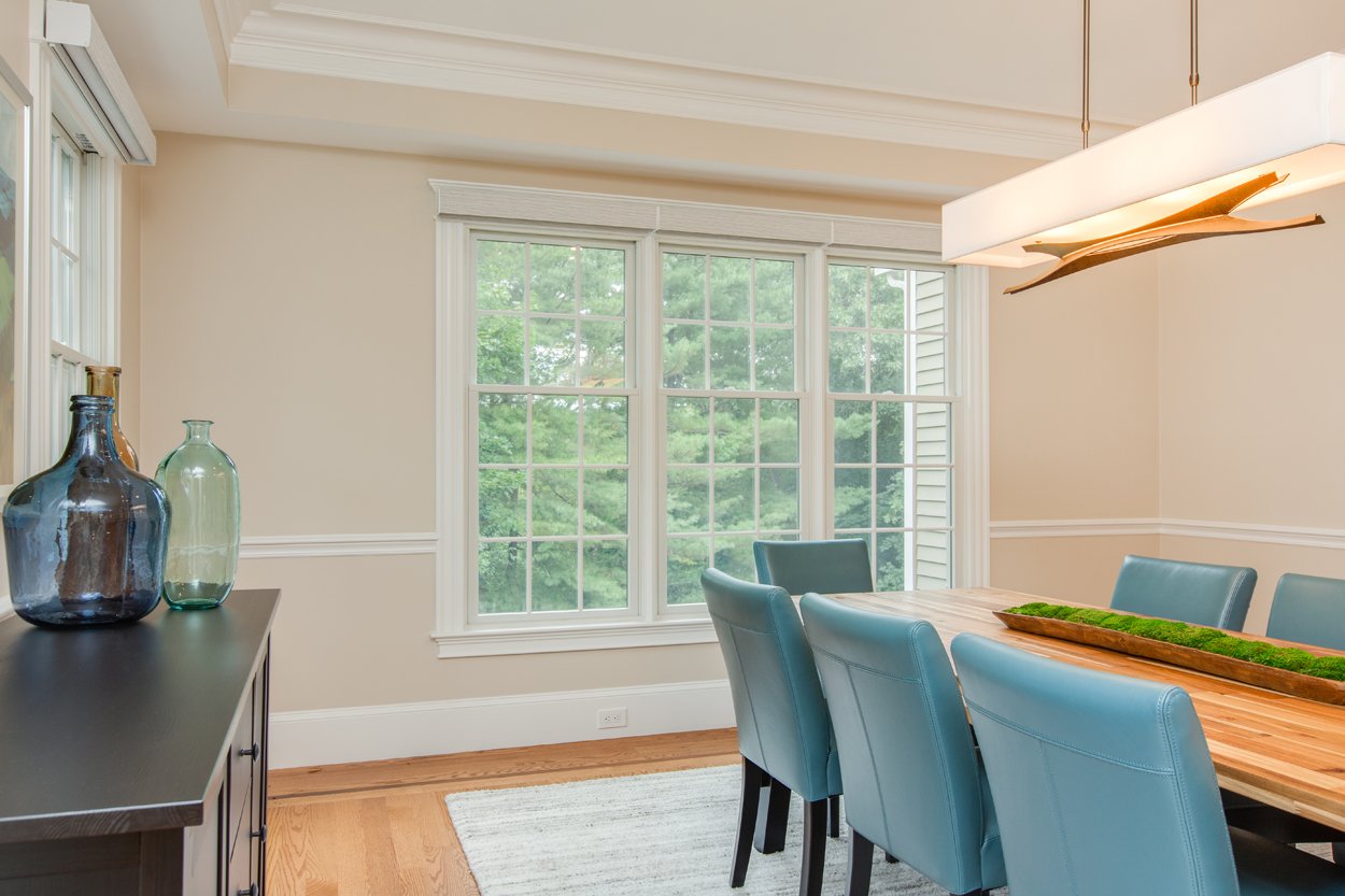
Our client requested to keep their dining table and server, which were already neutral and would go in the direction they were wanting. They also requested low maintenance and easy to clean dining chairs. We were able to add some pops of color into this space with chairs that pulled color from the art we had sourced. A Hubbardton Forge chandelier elevated this room, while making it feel not too formal. We finished it off with color coordinating vases to tie in the colors from the art and adjacent family room.
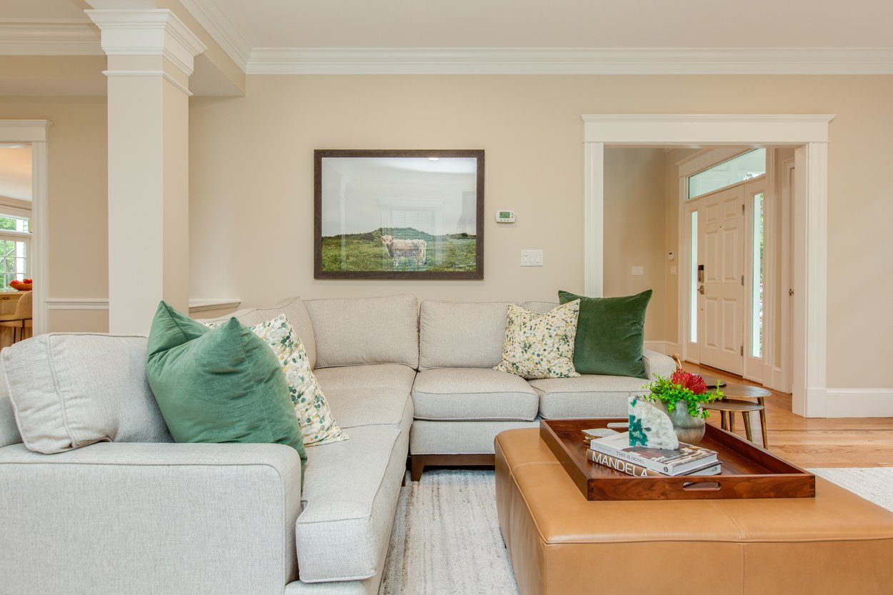
While furniture shopping at Ethan Allen, our client commented on the Longhorn Bull Photography, so that print along with the Dining Room art became the color inspiration for the space. We were able to find fun pattern pillows from one of our fabric vendors and then we were able to select the rest of the finishes and fabric to complement these colors.
A lot of the furniture you see through all of these spaces was sourced from our to-the-trade design vendors and retailers like Ethan Allen, Crate & Barrel, and West Elm.
Bathrooms
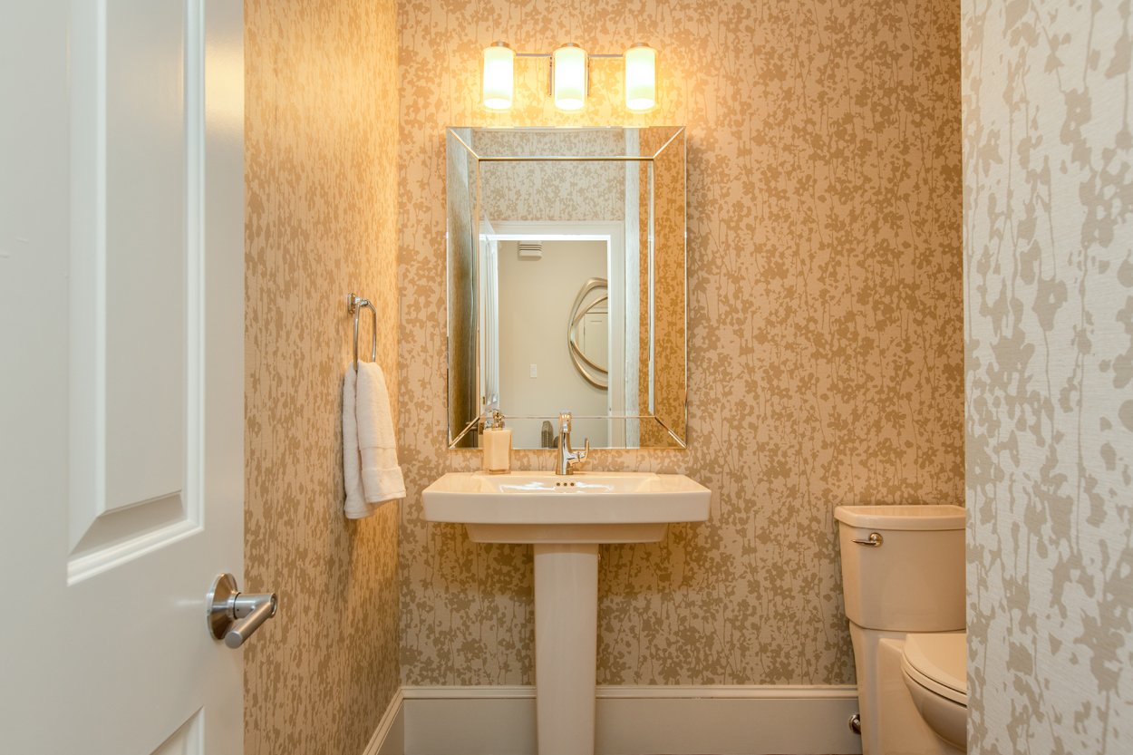
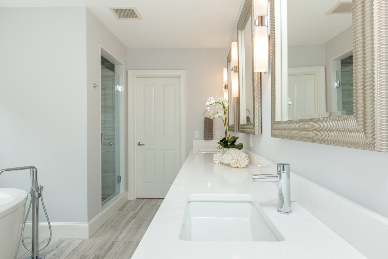
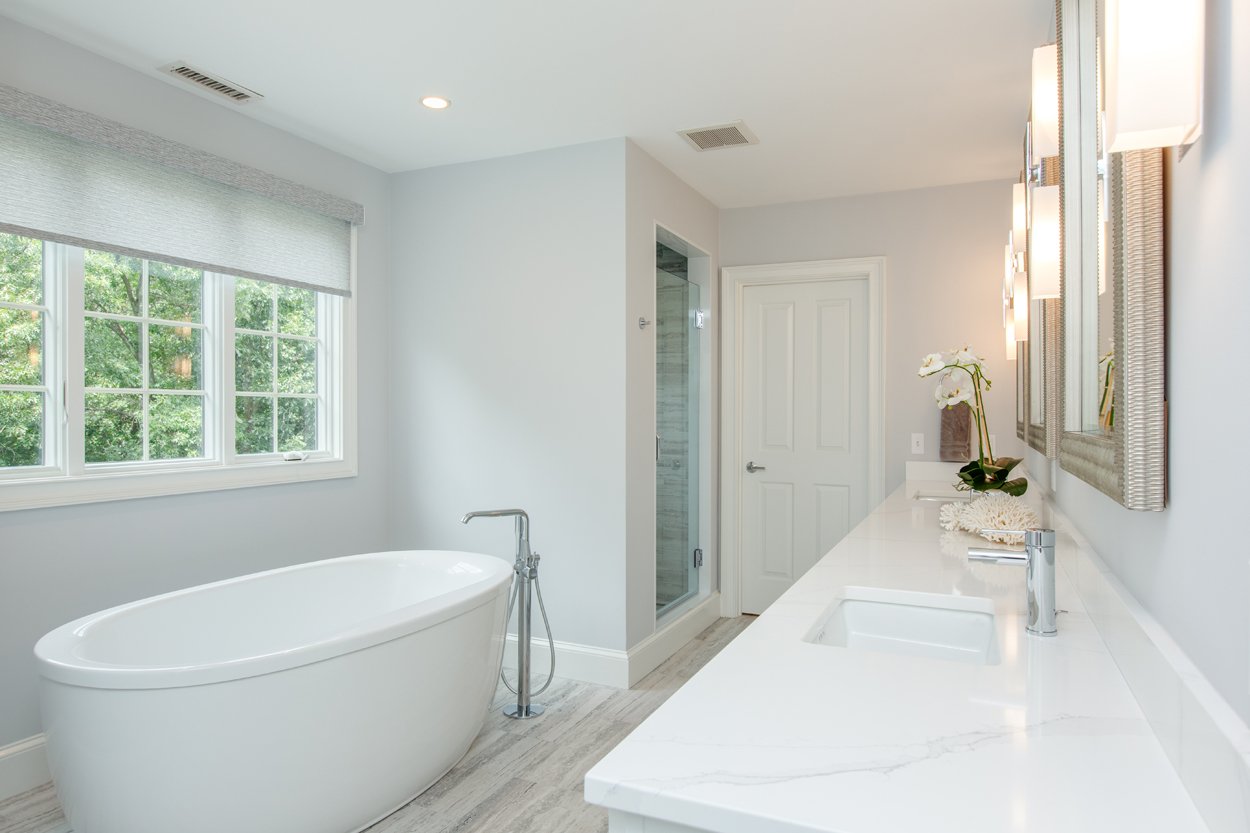
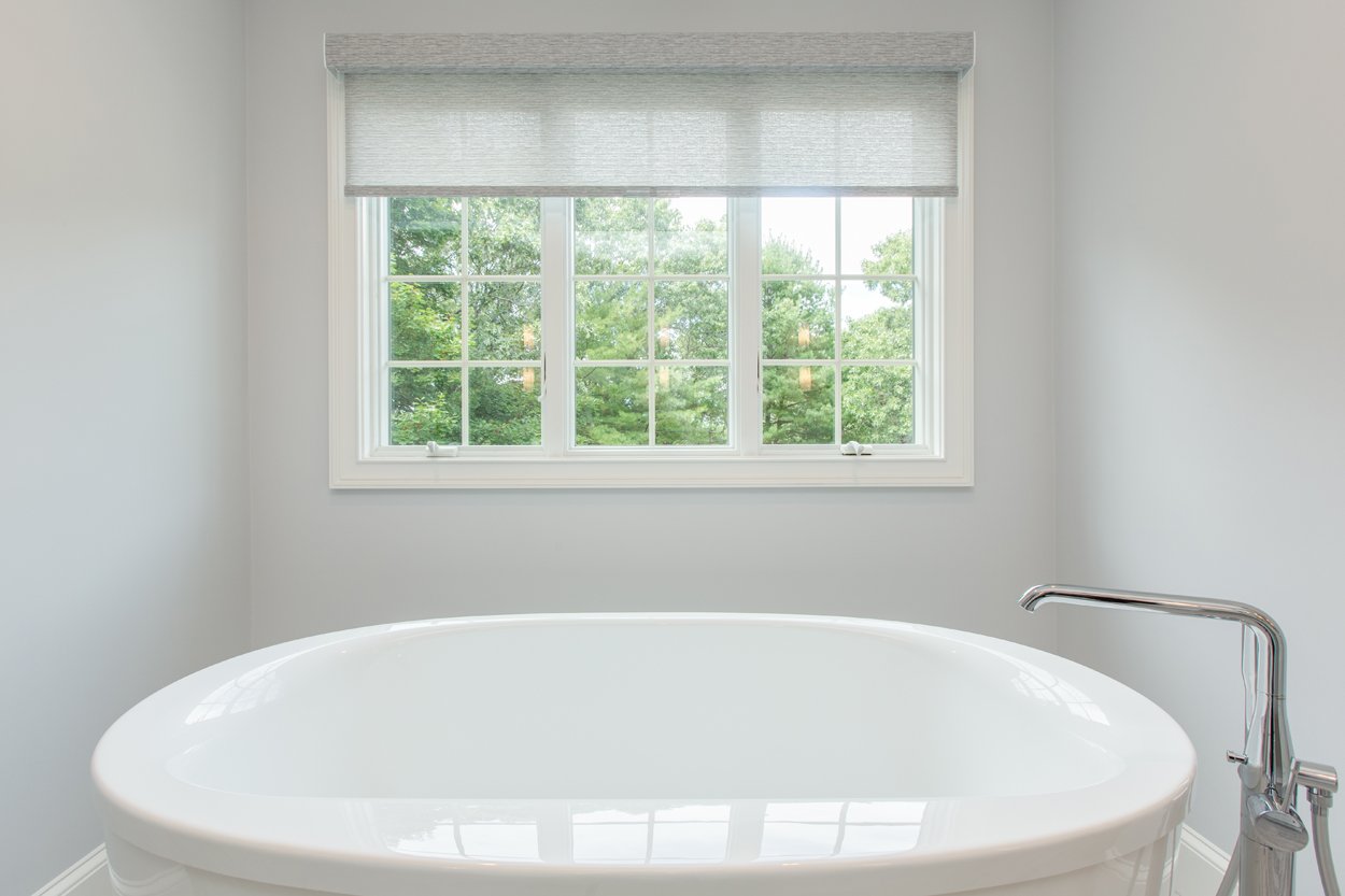
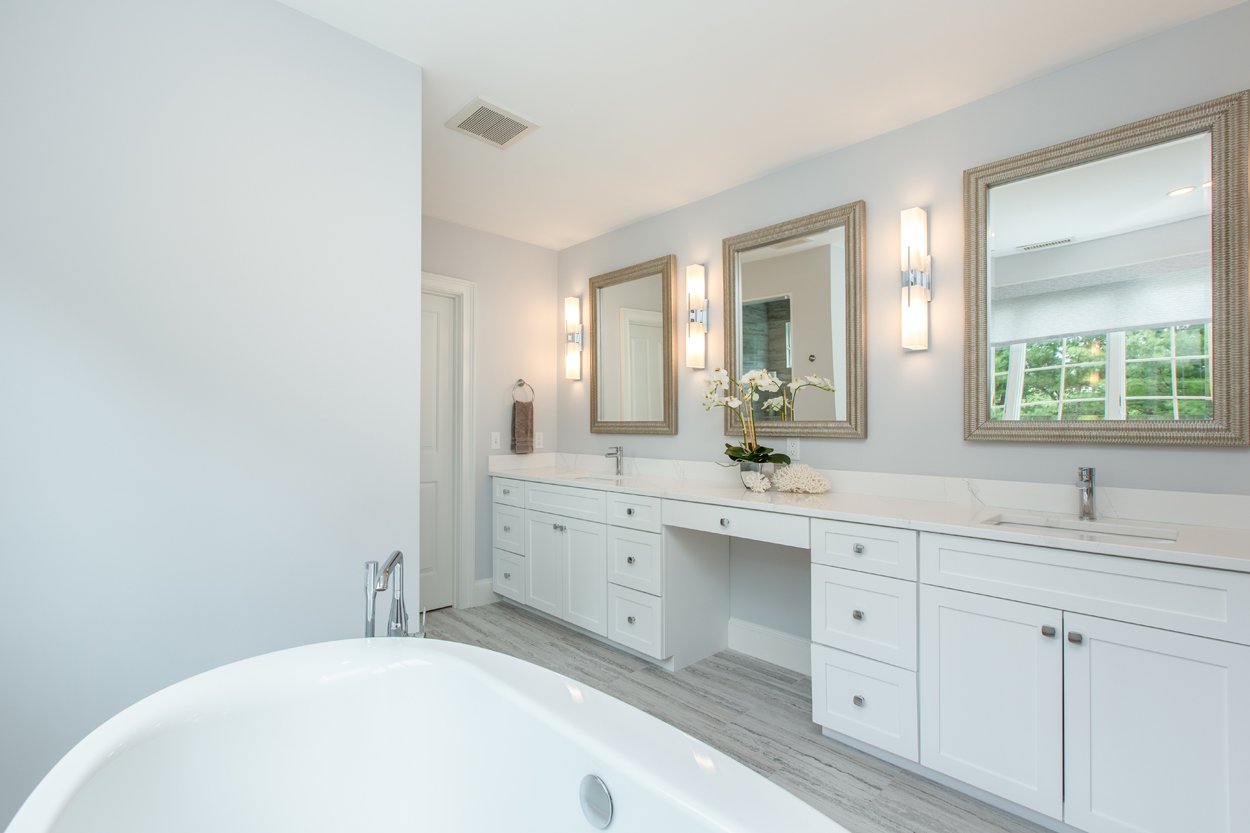
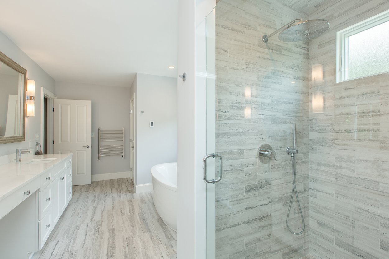
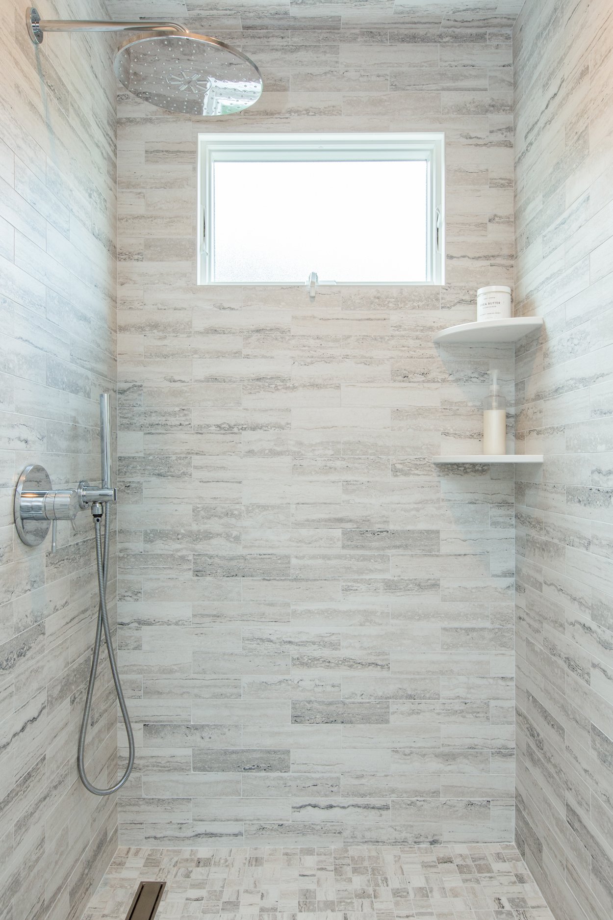
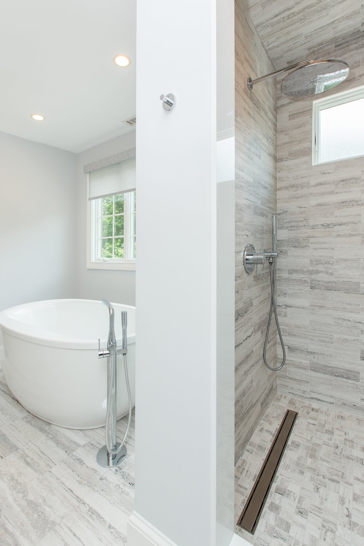
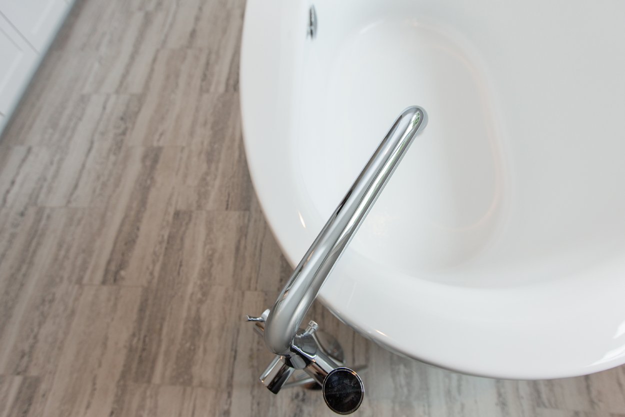
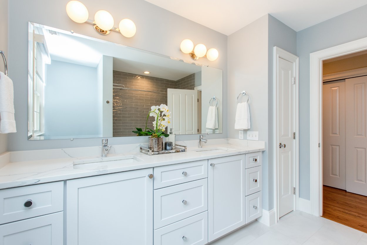
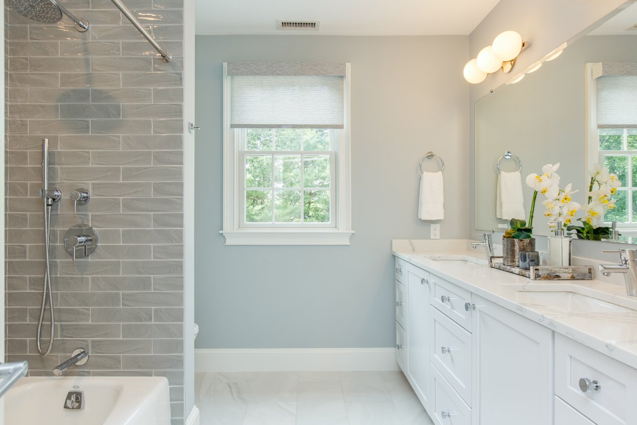
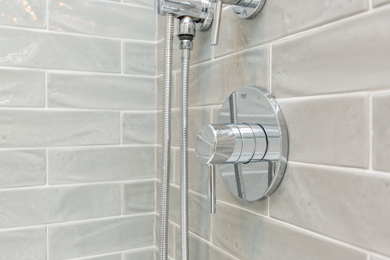
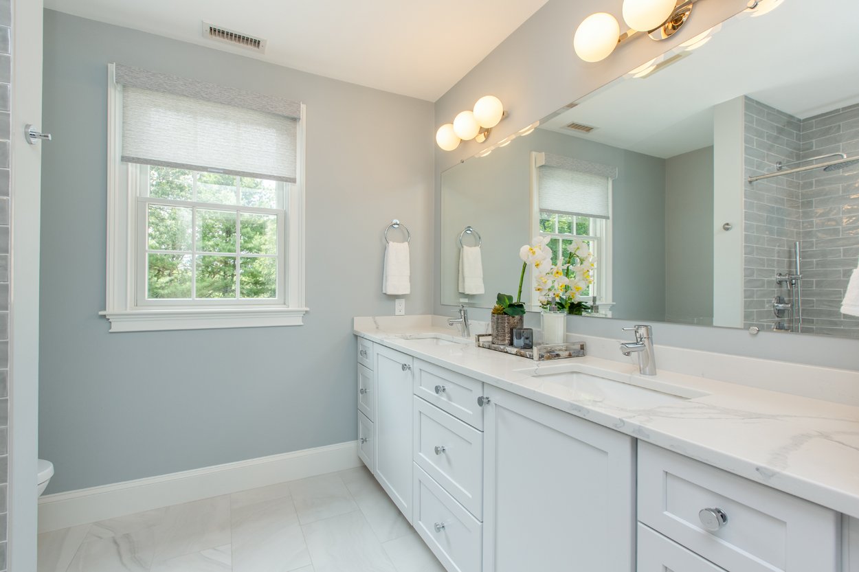
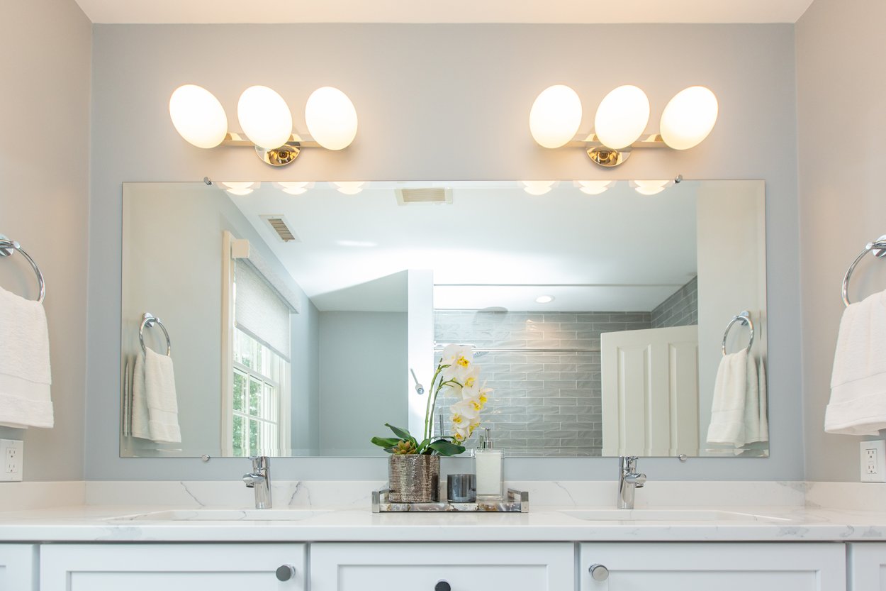
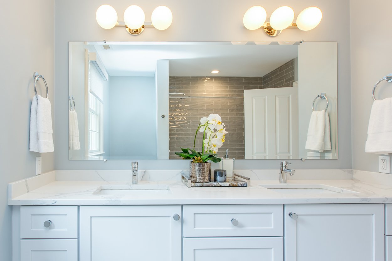
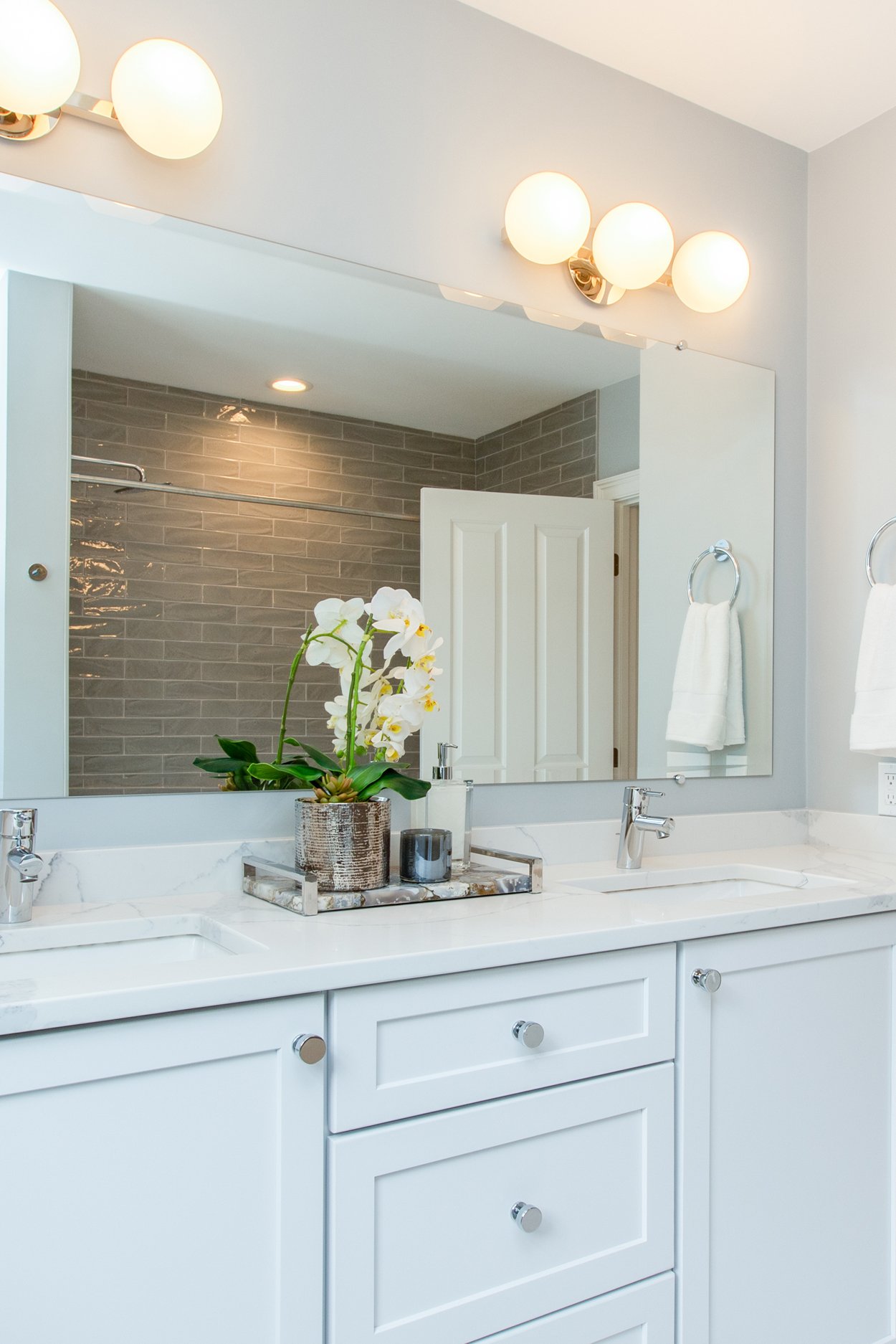
When it came to the bathrooms, we chose finishes and fixtures that would withstand the test of time and trends. From the earthy textured tiles, to compliment the simple veins running through the countertops that sit atop simple white cabinets, these are all things that will not go out of style. Modern Grohe fixtures throughout, paired with Possini Euro sconces to give the bathroom a little personality. These are items that, if needed, can easily be switched out to give the bathroom a completely new vibe. However, this bathroom, with it’s deep soaking tub, and luxury fixtures, is the “at home spa” we all want to come to at the end of a long week!